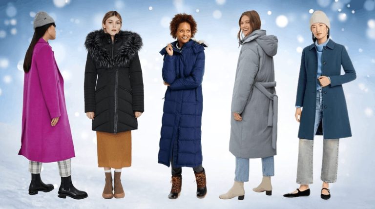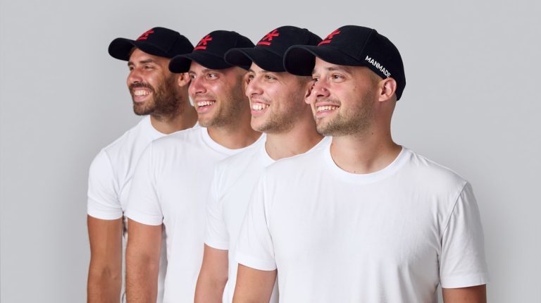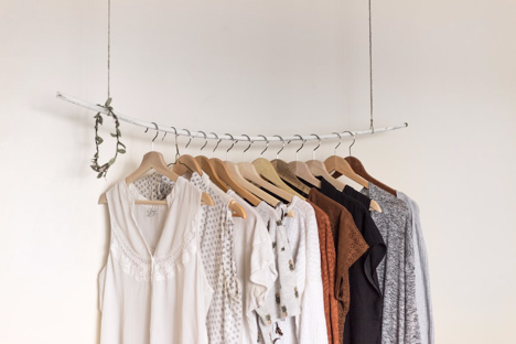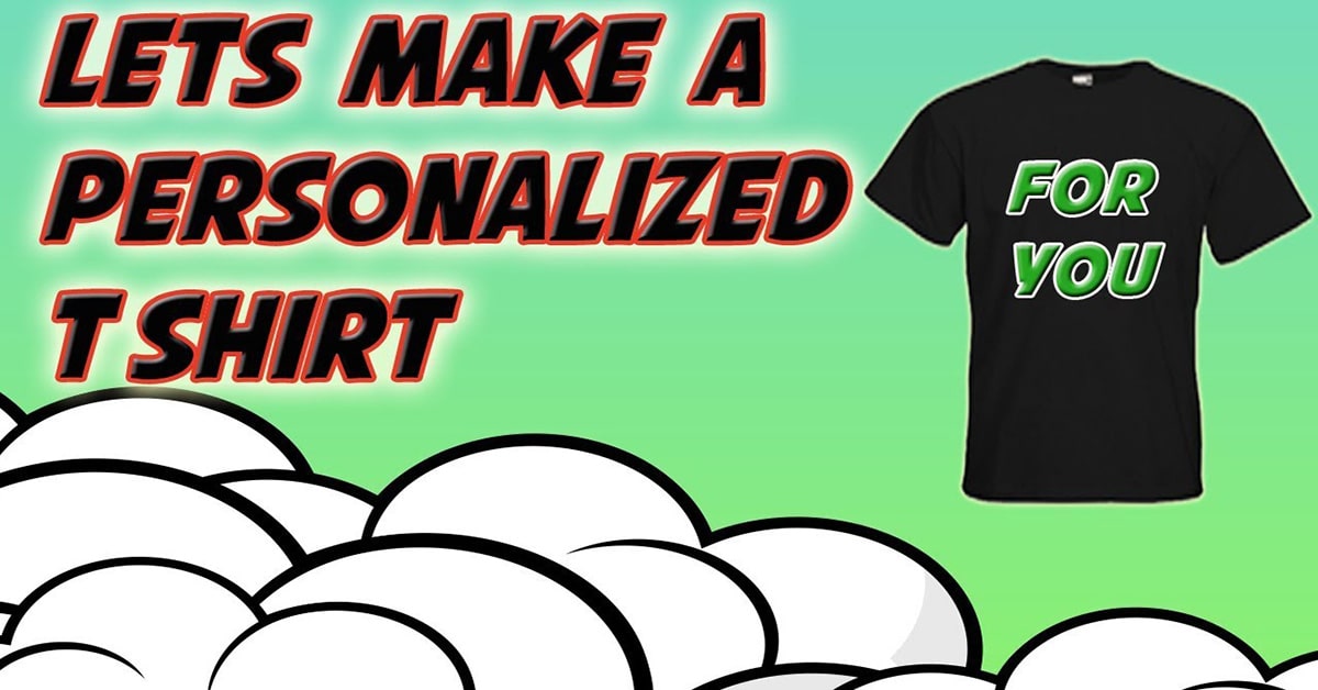
A quirky and bright T-shirt is a hard temptation to resist. Undoubtedly, a personalized T-shirt makes a fantastic gift choice. Customized T-shirts are the newest trend among individuals who want to stand out from the crowd. Customized merchandise is versatile, and many brands use it for promotional needs, giveaways, or introduce a brotherhood feeling among team members. Customized apparels also help people to create their merchandise. Merch makers can offer a unique way for fans to support the people they love through personalized T-shirts and other merchandise.

However, when you consider a personalized T-shirt, the entire essence of the T-shirt includes its design. Mistakes with the design of your T-shirt are likely to cost you much. For example, if you order a customized t-shirt for team members, that too in bulk, and if the design messes up, it’s going to get embarrassing and result in you losing face.
Below are a few mistakes that you can avoid to get that perfect design on your personalized T-shirt.
Poor quality fabric
The reason behind customizing a T-shirt could vary. However, no matter the occasion, fabric quality is essential. Before deciding on fabric, consider the fact whether you would wear an uncomfortable costume that tingles? The honest answer would be that no one would. Everyone understands the difference between superior quality and shoddy quality T-shirts. Further, the market gets filled with good-quality fabric that is affordable and leaves you with absolutely no excuse to choose the material that makes you feel uncomfortable.
Considering quality fabrics is especially essential for those in the corporate sector and custom t-shirts for employees or promotional needs. T-shirt quality represents brands and businesses. When they are worn, low-quality t-shirts can become an embarrassment for the brand.
Complicated designs
T-shirts and the audience are devised in a way to absorb only finite information. If your custom design includes excessive graphics or an overload of text along with various colour schemes, your t-shirt is likely to represent nothing but a mess.
It is best to add relevant information, make sure the graphics are classic and select the colour specifications with utmost care. The idea of a customized t-shirt is to convey your message swiftly, without getting people to scratch their heads with what your t-shirt represents.
A banner or a t-shirt?
Remember to wear customized apparel as they look best because they resemble clothes and not banners. Avoid copying your banner’s content entirely onto your T-shirt. Carefully decide what kind of information you would like to convey in the message. Make sure your content is catchy yet relevant. Avoid making your custom t-shirt resemble a banner.
Different sizes for different individuals
If you have selected custom t-shirts all in one size, you are likely to face trouble. It is essential to understand that one size cannot fit everyone. You have to get your custom-made t-shirts for different individuals in separate dimensions. It would benefit if you also kept in mind that the size of the t-shirt should not affect the look of the design.
Along with the size of the t-shirt, the size of the design is equally important. Design sizes should be too large or too small. Although, design size largely depends on the area available for printing; and it would also impact the placement. The print size varies according to the design that is selected and the t-shirt variations.
Avoid excess colour
Until and unless your custom design is rainbow graphic, it is best to avoid excessive colour schemes. Your design preference cannot justify the overload of colours. It is overwhelming to see so many colours at once. Moreover, the costs can reach beyond your budget with too many colours.
When you consider screen printing, the more colours, the more expensive your design becomes. The basic rule is to utilize two to three colours. Keep in mind colours form a natural part of custom t-shirts. If you mess up with it, your t-shirt gets messed up.
Disproportion of contrast
Contrast plays a crucial role in any art form, specifically in leaving a visual impact. In designing, the discrepancy is the difference between lighter and darker portions of the design. The aim is not to obtain high contrast but to get a strikingly appealing balance.
Contrast is not limited to colours but also includes free fonts, text size etc., if you have selected bold colours, and subsequently, the fonts for your design need to be of a contrasting shade. Contrasting shades intensify the look and enable readability.
Low-quality images
It is simple to obtain images directly from the internet and to utilize them as your design. But there is an error in the method right there. It is essential to check the image resolution before you send it for customization. Low-quality images can look great on screen but, when printed, look distorted.
For a design that gives off a professional look, always consider images that are high in resolution. Images are an essential part of your design, be careful not to mess it up.
Other articles from mtltimes.ca – totimes.ca – otttimes.ca

Reebok and Cardi B reveal their newest shoe